Your website is like your business’s front desk. It’s often the first thing prospective clients see before meeting you. You want your website to make a good first impression and have all the tools your clients will need to successfully interact with your business.
Unfortunately, “Contact Us” pages on websites often get overlooked in terms of best practices, when it should be the exact opposite. If your website is like your front desk, your “Contact Us” page is like your digital business card. If your site does a good job of engaging a prospect, you want your contact page to seal the deal.
Here are a few tips on how to create a great, converting “Contact Us” page for your website.
Make sure it’s easily accessible
You want your “Contact Us” page to be visible from every page on your site as well as everywhere else. Whether it be in the navigation bar of your homepage, the footer of your site or even a link you attach to your emails that directs readers to leave more information, you want prospective clients to be able to contact you from everywhere and anywhere.
Be clear with leads on what they should expect
Your contact page should display all the information necessary for a client to get in touch with you, but it should also let your leads know what to expect from interacting with your “Contact Us” page. For example, once they have filled out their information, it is best practice to leave them with a message explaining how and when they will be contacted so that they can know when or how to expect your outreach. Doing this not only reassures your prospects, but also makes you look more professional and attentive to your clients.
Here’s an example of a message you can use:
Thanks for getting in touch! We’ve received your information and one of our [job title] will be in contact with you soon/within the next [#] hours/days.
Keep your “Contact Us” page clean
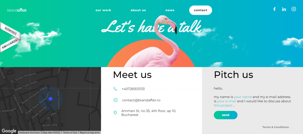
Though your “Contact Us” page should have some information about your business, it shouldn’t be confused with an “About Us” page where you describe your business operations in greater detail. Your contact page should display all the ways in which clients can contact you, a bit more information about your location and a call to action asking leads to leave their information.

Here are the contact details you should feature for your business:
- Address
- Phone number
- Map to your location
- Links to any social media pages or other platforms where you can be found
You want to avoid any unnecessary text or images on your page and keep it only to the main event: your leads leaving their information for future contact.
Ask only for what you need
A good “Contact Us” page doesn’t burden visitors with long forms they need to fill out. You should only ask for the information you absolutely need to get in touch with your new lead, and nothing more. According to survicate, a good contact page’s form should include 1 or 2 fields, the phone number and the name. Think about what information you need in order to contact the lead most efficiently and ask for only those things. Their physical address, for example, might not be necessary for you to conduct business with this person but an email address is.
In addition to asking for information, make sure you indicate which fields on your “Contact Us” page are mandatory. You can use a little asterisk (*) or even have the words “required field” written in parentheses.
Treat it like a landing page
When it comes to website design, many small business owners decide to focus on other pages and leave the “Contact Us” page without much TLC. Treat your contact page like a landing page and design it to speak the same language as your brand while offering your customers the visual experience they deserve. ImpactPlus recommends putting a video that has the following three criteria: first, it explains why the viewer needs the product or service, second, it explains what the product or service is, and third it explains what will happen next if the viewer begins using the product or service. But whether you feel inclined to add a video to your “Contact Us” page or not, make sure the design and feel of the page conforms to your brand’s standards.
Make it about the client
Instead of shouting how amazing you and your services are from the rooftops, use your “Contact Us” page to tell clients what you can do for them and how they will benefit from contacting you. You can also use tools to personalize your page. Perhaps you have a different form for different people, you can set your “Contact Us” page to ask the necessary questions when a prospective client fits a specific condition. This will make clients feel seen and start off your working relationship with them in a professional and appreciative manner.
Test and change your “Contact Us” page accordingly
Do you feel your “Contact Us” page is not properly converting? Test out different aspects like the placement or length of your form, the design and accessibility of the page, the calls to action, etc. The best way to come up with a “Contact Us” page that wins over new business is to keep trying until you figure out what’s working best for your business and your clients.
Is a “Contact Us” page really necessary?
In short, absolutely. It cannot be skipped. It’s a way to show prospective clients that they can trust you and that your business is, in fact, real. Think about it, what did you think about a business that was difficult to find or get in touch with? Do you want your clients to think the same about your business?
Whether it be for potential clients or existing ones, a strong “Contact Us” page really puts the cherry on top of a converting website. You want your digital business card to attract as many new clients and build trust with existing clients, and the tips on this list can make that happen for you.


