Having a good website might bring you some business, but having a great website will attract visitors and turn more users into engaged and active clients. If your website ticks off all the boxes of what a strong website should have, you are more likely to get discovered and booked by potential and existing clients. Getting found online is only the beginning, you need to wow your visitors so that they click through and convert into leads.
So you must be thinking, ‘okay, I have a good website, what’ll make it great?’ And we have the answers for you. There are 10 main aspects of a great and converting website that you must have:
- A great and modern design
- Intuitive navigation
- Contact information
- Converting CTAs
- Mobile optimization
- Quality content
- Strong branding
- Social media buttons
- Internal links
- SEO optimization
This article will go into greater detail about each one of the items listed above so that you can make sure your website is well equipped to convert leads into recurring clients.
1. A great and modern design

It goes without saying that your website needs a sleek and modern design. Your website is your business’ front desk, it’s the way you make your first impression. Your site reflects your brand, your services or products, and the story you are trying to sell.
Make sure your website isn’t cluttered with too much content or visuals. It should be visually appealing and professionally designed with good quality photos and videos. Choose colors and fonts that don’t clash and aren’t too abrasive to the eye. Use text that is large enough to read but not too large that it’s distracting and users are forced to scroll down a lot in order to read.
As the internet changes often, you’ll need to make sure your website is adhering to the most updated design standards and security needs. Take a look at your top competitors’ sites and compare, get inspiration by researching what’s out there, and always make sure your website is as updated as possible.
2. Intuitive navigation
Your website menu (also known as the navigation bar) might seem like a trivial part of web design, but it’s actually more important than you think. There are many options for a navigation bar: scroll down, drop down, pop up, etc. But what’s most important is what you put in there. The navigation bar on your website should be intuitive and easy to understand.
Don’t use fancy or what you may think is “catchy wording”. Instead, use the same terminology that’s being used across sites in your industry. Make the titles clear, display only the most important pages, and, whichever option you choose for the supporting content, ensure consistency all around.
The last thing you want to do with your navigation bar is to ensure the links are active and not broken. Each one of the sections in the hierarchy of your navigation bar should link to its respective landing page. Broken links will turn the user off and likely make them bounce (or leave your site).
3. Contact information
Your contact information should be clearly visible and easily discovered. You’d hate to lose a potential client just because they couldn’t find a way to contact you. When we say contact information, we mean a phone number, address, email address and, of course, links to your social media pages.
You’ll want to have a “Contact Us” page that converts, and a tab for it in your navigation bar as well as in the footer of your site. Having your contact information in the footer of your site will mean that you can be easily accessed from any page on your site, which is important.
Using a form on your “contact us” page is a great way to start collecting information about your leads and prospective clients. It’s not only a way to contact you, but it’s also a way for leads to begin engaging with your business. Keep the contact form short, don’t ask for any information you don’t really need, and use the data aggregated to begin a personalized onboarding process with the lead.
4. Converting CTAs
The call to action (CTA) buttons on your site need to be good enough to convert users into engaged clients. In order to create a strong, converting CTA button, you’ll want to follow a few simple tips. You mainly want your CTAs to be short but pack a powerful punch with their messaging. This means that in a few short words you create a sense of urgency, entice users to take action and grab their attention with colors and fonts that make sense for your brand.
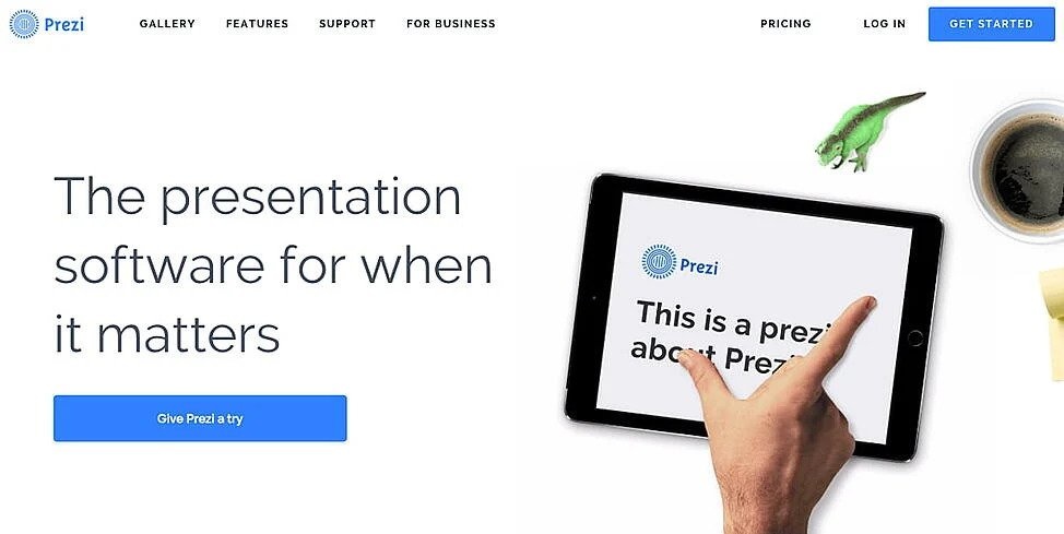
In addition to writing and creating the best CTAs, you also have to be sure to put them in the right locations on each one of your site’s pages. You want one CTA above the fold (or the visible page when it first loads) so users don’t need to scroll down in order to take action. Having a CTA button readily visible when a page loads increases the chances your users will click through.
5. Mobile optimization
Your website should also be responsive. This means that the way it looks and loads changes based on the device being used to view it. Since, according to DataReportal.com, 92.4% of internet users are using mobile phones to access the internet, and more than half of our internet time is spent on a mobile device, making sure your website is optimized for mobile is not a “nice to have”, it’s a must have.
Mobile optimization for your site looks like pages that load on a small screen without forcing a user to pinch to zoom in or out of a page. Your content, images, videos, etc., should all load smoothly and be just as visually appealing as your desktop site.
Another reason to optimize your site for mobile is Google. Google’s algorithm takes mobile optimization into consideration when ranking your site for search results. So, if your website isn’t optimized for mobile but your competitor’s is, their site will show up on a search results page before yours.Finally, it is critical to ensure your website is responsive because people with certain disabilities can only access your site via mobile. You can test whether your site is responsive and accessible, for that matter, using a website accessibility tester.
6. Quality content
Providing value to your website visitors is an important step to getting them to trust your brand and believe in what you’re selling. You want the content on your site to be concise, clear and consistent with your brand’s tone of voice. Your audience can see through your writing content just for the sake of writing and this will cause your audience to lose interest and bounce quickly from your site.
Quality content means your content has a clear purpose, and it achieves its purpose. You want to provide content that directly answers the needs of your audience, reflects your expertise and is SEO optimized.
In order to make your content easy to digest and understand, utilize headings, subheadings and visuals to organize the text on all your web pages. For SEO, ensure each page on your site has the correct keywords present as many times as necessary for your pages to be ranked high on Google.
7. Strong branding
As your website is the front desk of your business, it needs to speak your brand’s language. From the colors and font to the visuals you use, everything you present on your website should accurately reflect your brand’s values and purpose. Your logo should be large enough and visible on each page.
Your domain name should also be simple and reflect your branding. Having all the elements on your site tell a cohesive and clear story helps users of your site identify your brand and increases your brand awareness significantly.
8. Social media buttons

It’s 2022, social media runs the world, and your business is no different. Social media is the best platform to get the word out about your brand and services, as well as a great place to keep your audience engaged and up to date on what your business is all about. Your website, without social media support, is you fighting half the battle when it comes to connecting with potential clients.
There are two ways to go about using social media with your website:
- You should have social media buttons that link directly to your own social media pages where clients and website visitors can go and see the content you post.
- You should include “share” buttons on the content you put out so that website visitors can easily share the content on their respective social media pages.
Using social media by allowing visitors to share your content, while sharing the content yourself, is a stepping stone to increasing your brand awareness and authority; two things which you need in order to differentiate yourself from your competition.
9. Internal links
Though this may sound a bit scary, considering it’s part of SEO and you may not be an expert in that, it’s still an important and relatively easily implemented practice. Linking internally means that one of your webpages links to another page on your website. This helps improve your user’s experience and, as mentioned before, improves the chances of your site ranking higher on SERP (search engine results page).
You can add a “related posts” section to your blogs and link to blogs that are related to the subject you’ve just written about, and, the pages of your website (like the services pages) can link to other pages on your site by way of a CTA or even a “read more” link. These are two easy ways to start internal linking right away.
10. SEO optimization
We’ve saved this item for last because it’s a doozy and probably one of the hardest things to attain. As a small business owner, you have a million things on your plate, and learning small business SEO might not be one of them. However, you should take some time to learn at least the basics. Things like utilizing headings and subheadings, adding in keywords, and internal linking are all the beginning basics of SEO and will greatly assist in ranking your website higher.
In addition to the tips already mentioned, you should also make sure each page has titles, meta titles (the title displayed on SERP and browser tabs) and alt tags (the text that will appear in case your image doesn’t load) on each image used. Keyword research is crucial and keywords should be used as often as makes sense, and finally, keep your HTML code as clutter-free as possible.
Your website is a lead generation tool
Don’t consider your website as just a way to get the word out about your product or service, it’s also a lead generation tool. Your website can convert users into engaged clients, so you want to make absolutely sure you are doing everything in your power to create the most successful website possible.
By ensuring your website contains all the items on the list above you are maximizing its efficiency and getting the most out of this lead generation tool. These basics will help you gain more value from your website and take your site from being “good” to being “great”.

