An appointment confirmation email is the scheduling equivalent of a mint left on a hotel pillow; it’s a small additional effort that signals to your client that you care about the details of their experience. In addition to being a proven way to help you avoid no-shows, confirmation emails send a message to your client that they can expect great customer service and professionalism from you.
If they’ve booked with you online, their appointment confirmation will be the first personalized communication they receive from your business. Making it count by including a thank-you, helpful links, and opportunities to reschedule if needed. A great confirmation email is a first impression that your client will carry with them through your door.
Confirmations and reminders: what to send and when
A confirmation email gives your client an overview of your plan for their appointment. It’s a summary of what they purchased or intend to purchase, the amount paid if applicable, and when the meeting will be. It’s best to send a confirmation email directly after the client books the appointment, so they aren’t left questioning whether or not their payment went through.
If the client has booked the appointment well in advance, many businesses choose to send them an additional reminder email or text message shortly before the appointment. This can be a more concise message—the focus should be on the appointment date, time, and place.
Reminder emails are especially important for businesses with a cancellation policy. Although most businesses will choose to send the reminder email 24 hours before the appointment, keep the timing of your cancellation policy in mind. Make sure that clients receive the reminder email in time to cancel their appointment without having to pay any cancellation fees; this will help communicate to clients that your cancellation fees are a last resort and not a way to make extra money.
New vs. returning clients
In some cases, new clients might need different confirmation emails and reminders than returning clients. Below is a brief summary of how these communications might look for new and returning clients:
- New client
Appointment confirmation emails for new clients might include extra information about the venue or what to bring. Save time by attaching any waivers and forms for them to fill out digitally and send back to you. You could also think about sending a new client an itinerary or what to expect from your services, especially if you’re a niche service they may not have used before. New clients booked with a staff member might benefit from an introduction in the form of a picture and great staff bio. - Returning client
Returning clients might not need as much introductory information, but if you’ve been using CRM to keep track of your client’s history, then use it to personalize their confirmation email. For example, hair salons that keep information about a client’s past cuts and color can send reminders about their last haircut, so they can think about whether they want something different. Clients returning for music lessons will appreciate the extra touch if you remind them of their previous skill level, and give them an option to request either a refresher or a more advanced lesson. Even a simple “welcome back” message can go a long way in helping clients feel like you’re paying attention.
What to include in an appointment confirmation email?
Right after a purchase is a key point in the email marketing lifecycle. Now that your client has made an appointment, you can help keep them coming back with a great confirmation email that includes the following:
- A succinct subject line
The best subject line will include the words “Appointment confirmation,” and the email should be structured so that the date and time of the appointment show up in the email description—that way, your client will be reminded of their appointment time whenever they open their email inbox. - Who they’re meeting with
If it’s you, make sure to include your full name and title, or the full name and title of any staff members they’re meeting with. Include phone numbers, addresses, extension, and any other contact info your client might need to get in touch. One convenient way to do that would be to create a digital business card by checking online resources on the best digital card solutions. Add all your links as a scannable QR code. - What type of appointment this is for
The level of detail you include will depend on the industry. For example, medical or legal appointments will often carefully itemize the services the client has booked. On the other hand, a life coach might not know exactly what the appointment will look like until it happens. In general, you should include enough detail to minimize any confusion, in case the client forgets why they booked you. - Date and time
The date and time are the two most important pieces of information. Make sure they stand out in some way. - Place
In addition to your address, it’s a nice gesture to include an embedded map, or to link your address to a map to make you easier to find. If you’re right next to a common landmark, think about making a note of it, particularly if people often have trouble finding your office. If the appointment is online, include any links to webinars or chats. - Cancellation Policy
If your client has paid an advance, make sure you include the amount paid and your cancellation policy. The policy should be clear and in a prominent place—this will help minimize the hassles involved in enforcing it when you need to. - Add to calendar button
Giving your client the option to add the appointment to his or her Google or Outlook calendar means they’ll be able to set their own reminders for it. It’s a way to let clients take their appointment reminders into their own hands, increasing the likelihood that they’ll show up. - Thank your client
Make sure to include a quick thank-you message. If this is the first in what’s likely to be a series of appointments, consider including a brief welcome. It’s easy to forget to add these personal touches, so if you do it, your professional courtesy will help you stand out.
A confirmation email should be part of your branding and retention strategy
Before you design your appointment confirmation email, take some time to map your customer’s journey. What information does your customer already have about you? What links did they have to click through to book the appointment? What information do they need now?
In marketing terms, a confirmation email is a part of your customer retention strategy. They’ve already committed to a purchase, so now your focus should be keeping them coming back. This means building trust in your brand, with both a consistent brand voice and great customer service.
Start doing both by building them into your confirmation email:
- Include your brand
Like all your formal communications with clients, your confirmation email should be consistent with the rest of your brand. Include your logo and any fonts, colors, and photos that reaffirm your brand identity. If you’re on social media, it’s easy to include links to social media accounts in your email signature. - Your tone should match your business type
The level of formality you choose for your confirmation email should match the tone of your general brand voice. If you’re a lawyer or accountant, it’s best to choose a formal, professional tone. But if you’re a salon with an upbeat, fun brand, then have fun with your confirmation email! Make it as colorful and vibrant as your website. - Be careful about up-selling
You’ve already made the sale; up-selling in your confirmation email risks damaging your client’s trust. However, it’s useful to note that in some industries, upselling in a confirmation email is the norm—for example, a flight confirmation email might have hotel offers attached, and salons and other industries might include referral offers. Knowing your industry is the first step in knowing when you can upsell. - Make a visual hierarchy
Your confirmation email is there for your client’s convenience, so make sure it’s convenient to read, too. Establish a visual hierarchy in which the important information stands out from the rest. It could be bigger, in a different color, or surrounded by a text frame; anything that helps identify it as the first thing to read. - Test the look of your email on different devices: once you’ve got a template, make sure it looks great on mobile as well. Sometimes images and other elements that haven’t been formatted for mobile become illegible on smaller devices—so test your email to make sure your client can read it no matter where they are!
5 examples of great appointment confirmation emails
Here are a few examples of confirmation emails that include a lot of the information listed above. In addition, they include some unique strategies that help keep the emails clear, informative, and well branded.
1. appointment confirmation email – vcita
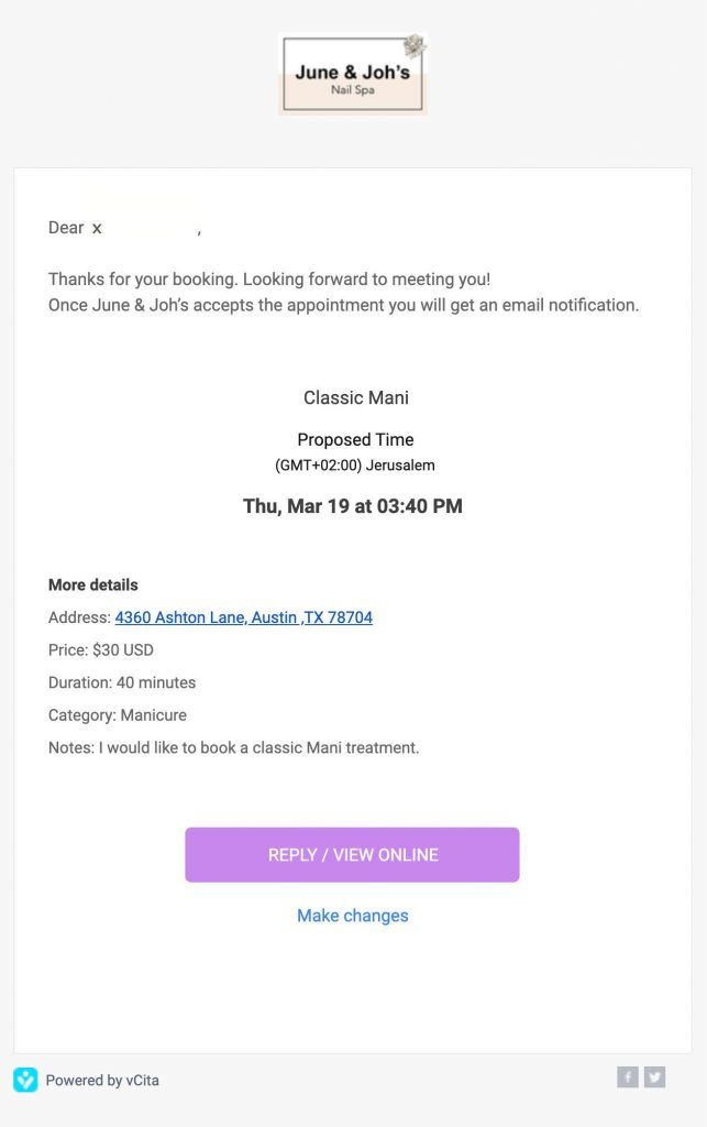
vcita’s email layout is friendly, simple and easy to read. The friendly greeting in the introduction makes the client feel welcome and gives the email a personal touch. The time, date and service are highlighted in the center of the email, which makes it clear for the client to get a quick overview of the service he has ordered. The ‘reply’ button, encourages the client to click through to the website, which is a great way to drive the client to take further actions on your website. Finally the ‘make changes’ button, makes it easy for the client to change time, date or service type, if he wishes to make adjustments.
This email works because the address, links, dates, and other information is kept simple and clearly divided. The design is clean and minimalistic, and make you appear professional.
Say goodbye to no-shows and last-minute cancellations. With vcita you can set up appointment reminders or request attendance confirmation before appointments to make sure your clients never miss a meeting.
2. appointment confirmation email – UberConference
UberConference’s email gives you all the information you need to remember and join the conference in one small space. Although the date and time are small, the white space surrounding them makes them stand out. The “Ways to Join” section and “Invited Participants” section are separated to make the information easier to parse, and links are provided for all the contact information. Since the platform offers a way for different types of conference calls to take place, the tone of the email is neutral—likely so it doesn’t conflict with the anticipated subject matter of the call.
3. appointment confirmation email – Rover
Rover is a platform that offers pet sitting and dog walking services, and this email is a confirmation that the provider the client has selected can offer the requested service. In this case, the user has to click on “Confirm This Stay Now” in order to finalize the booking; this is a good idea for services in which people might be talking to different providers at the same time. Instead of being neutral or formal, the email has fun branded elements, like the equation below the acceptance confirmation and the referral copy.
4. appointment confirmation email – Codeverse
This confirmation email for a trial class is a great example of how simple it can be to create brand uniformity. The map pointer is an inverted logo, which establishes brand identity within the map image and mirrors the logo above it. The friendly greeting and block of text welcoming the client provide a nice segue to the information below the map, which is very clearly categorized under bold headlines. Note that Codeverse has also made it clear that the client has not paid for the session. Although it might seem unnecessary, this additional detail will likely help prevent questions about whether or not their card was charged, particularly if they have already subscribed to another service through the same company.
5. appointment confirmation email – Elske
This reservation confirmation is for a popular restaurant in Chicago—so popular, in fact, that they’ve charged a $50.00 deposit. The short introductory paragraph is framed in a grey text box, which helps draw more attention to the reservation date and time in bold below. The link to “Manage your reservation” stands out the most, likely to encourage customers to change reservations themselves rather than calling the restaurant and interrupting a busy workflow. The repetition of the payment amount, subtotal, and total might seem redundant, but it makes it clear to the customer that no taxes have been charged, in case the meal is a business expense. Below it, they outline their cancellation policy and link to their contact email and phone number.
Ways to send appointment reminders
Giving your clients an option about how they’d like to be contacted is a good way to ensure you’ll get ahold of them. If you send a confirmation email as a default, consider offering a phone call or text message reminder. Just make sure you double check with them first. Different clients will have different comfort levels with how much you contact them, and the last thing you want is a client that feels inundated with reminders. Here’s an overview of the pros and cons of each method of getting in touch.
Phone calls:
Pros: this method can be a nice, personal touch for clients who prefer to speak with someone in person. It also gives the client an opportunity to ask any last-minute questions or make changes to their appointment if they can’t do it online. Cons: it takes time to call each client, which is great if you have a receptionist who needs something to do, but not so great if you’re already too busy. You’ll have to leave voicemails if clients don’t pick up their phones, but if those clients don’t check their voicemails, your time reminding them will be wasted.
Text/SMS:
Pros: texts can usually be sent automatically using the same software you use to schedule reminder emails. Many clients prefer to receive reminders via text, and you can still send links to maps for directions. Checking text messages is often more convenient than checking voicemail or email, so it’s more likely you’ll get through. Cons: text messages should be very brief, meaning that you’ll have to condense the information down to the bare minimum. Also, if you use scheduling software to send the texts, your clients might not be able to reply to them directly.
Email:
Pros: emails let clients see all the information at a glance, with links, maps, and branded content all in one condensed message. Email tends to be seen as less intrusive than text and phone calls, and it’s easy for clients to add the event to their calendar last-minute. Cons: there’s a risk of your email ending up in your client’s junk mail folder. Even if it doesn’t, it’s still possible for it get buried under other emails, depending on how busy your client’s inbox is. Some people have separate email addresses for work, personal, and shopping purposes, and check the “shopping” email less often.
You don’t get a second chance to make a first impression
A great confirmation email will help you and your client get off on the right foot. Scheduling software like vcita automatically sends professional confirmation and reminder emails to your clients at the right times, so you don’t have to remember to. With minimal effort, you can make sure your clients are afforded the courtesy of a friendly reminder. Great customer relationships are often built on all the little things—and sending a helpful confirmation email is a little thing that can make a big difference.

