As small business owners, we fight tooth and nail to drive traffic to our websites.
And we do it all in the hopes of landing that next client.
But what happens when your site starts to feel like a ghost town, with visitors coming and going without a trace?
If this story sounds familiar, don’t worry: you aren’t alone.
If you want to turn a sales lead into a long-term client these days, you need to grab their attention immediately by setting up your site the right way.
How to Encourage Leads to Leave Their Contact Information
Think of your website as a sort of puzzle. Converting today’s busy, skeptical visitors means having the right pieces on-site come together to encourage action.
Based on what we’ve seen working with our own clients over the years, we’ve put together a list of tips, tools, and strategies to do exactly that!
Oh, and you don’t have to start your site over from scratch to get started.
1. Use a Lead Generation Widget
Spoiler alert: a Contact page isn’t enough to win over leads anymore.
Why, though? Well, the old-school contact form is dead for a few reasons.
For starters, people simply don’t have the time or patience to dig for your contact information. This is especially true if they’re looking to do business via mobile. Instead, the opportunity to get in touch should be front and center so there’s no second-guessing involved.
Also, some prospects might be skeptical that their information is simply being dumped somewhere. Rather than rely on a bland form, a secure, eye-popping “contact us” solution is a smart alternative.
With lead capturing tools like vcita’s lead generation widget, you tick all of these boxes. As soon as visitors land on your site, this visible (yet not intrusive) pop-up follows them from page to page without disturbing their browsing experience.
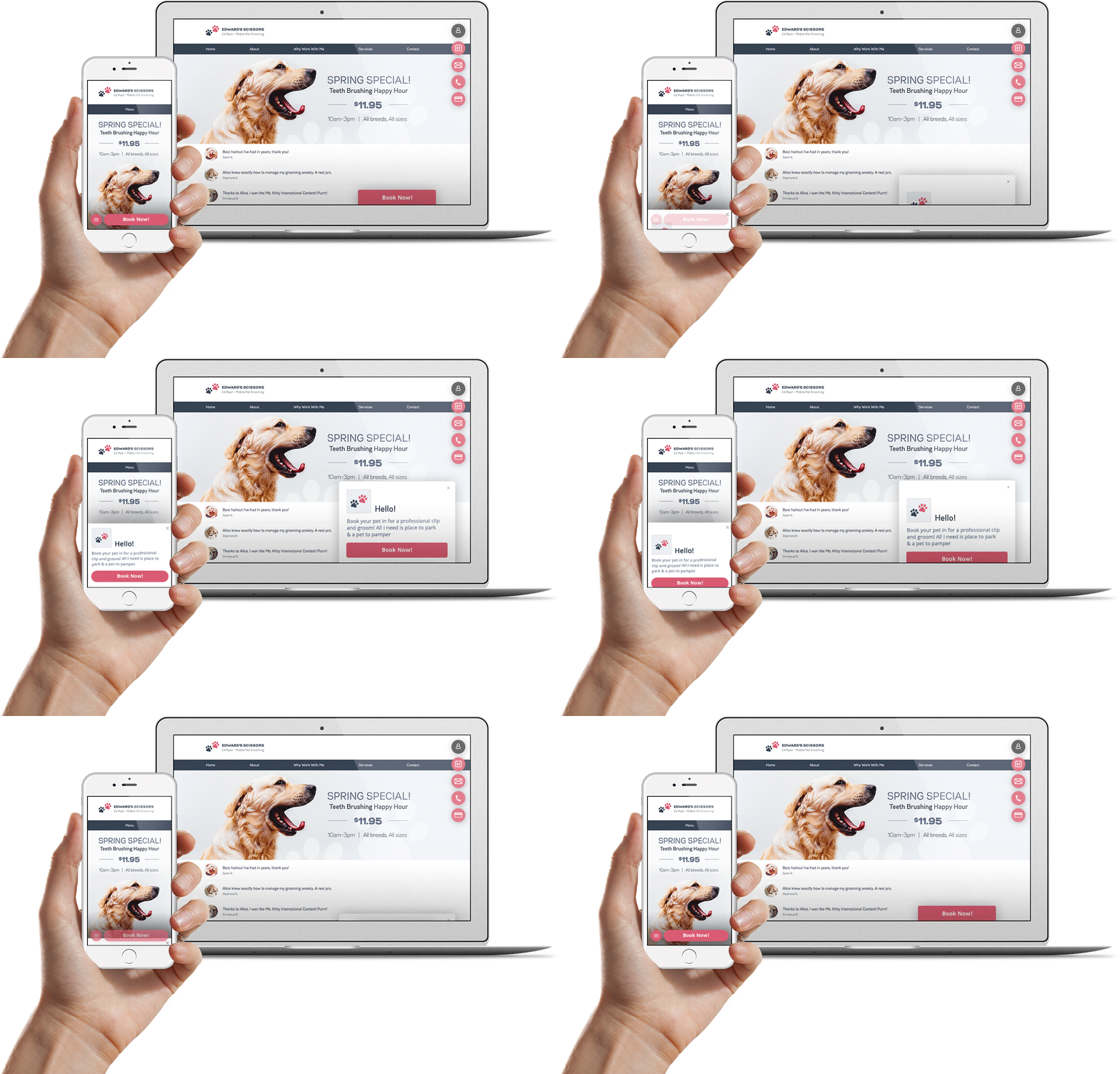
This widget also allows visitors to book appointments directly without leaving your site. As part of vcita’s CRM for small business, all of your visitors’ contact info is stored in one place so you can reach out to them later.
Beats the pants off of a boring old contact form, right?
2. Make the Contact Process as Speedy as Possible
The quicker you make the “contact me” process, the better.
Why? Because lengthy, tedious forms are among the top reasons people bounce from sites in the first place.
And given how short people’s attention spans are, this totally makes sense.
Just like visitors shouldn’t have to dig through your site to leave their information, they also shouldn’t have to fill out a novel’s worth of forms to do so.
Here’s an example of what a straightforward sign-up form looks like within vcita’s lead generation widget.
When in doubt, strive to gather just the basics when it comes to your contact pages, limited to:
- First and last name
- Email address and phone number
- The reason for reaching out (could be a unique field, booking option or an option they can select)
- An optional field for a special note
And boom! You’re good to go.
The last two points (reason for reaching out and notes) are important for personalizing your follow-up and understanding what your leads are looking for.
That said, the ball should be in their court in terms of whether or not they want to leave more information or keep it simple.
Because hey, for every client who wants to do the bare minimum, you might also have someone who wants to tell their life’s story. A combination of minimal required contact fields and more detailed optional ones gives your visitors the best of both worlds.
3. Offer Up a Freebie
Everyone loves a good freebie, right? Your leads do, too.
Many visitors look at leaving their contact information as a sort of exchange.
Sure, they’re going to hook you up with their email or phone number.
But what are you giving them in return?
Lead magnets such as e-books, webinars or cheat sheets are popular freebies online businesses use to win snag their visitors’ contact information.
What if you’re an in-person, appointment-based business, though? Fear not!
You can offer a free introductory phone call or consultation to see if your services are a good fit for your leads and vice-versa.
Getting straight to the point with a consultation avoids needless back-and-forth and gets you on the phone straight away with your hottest leads.
In a way, your leads feel like they’re getting a sweeter deal because they’re getting something for nothing. Free consultations also demonstrate confidence in your business and your willingness to help out potential clients.
And if nothing else, simply getting on the phone with even a so-so lead definitely beats them bouncing from your site, right?
4. Cook Up More Creative Calls to Action
This might seem crazy simple, but it’s really easy to overlook.
If you want visitors to leave their contact information, they need to know where to click.
This means making your CTAs loud and clear, enticing leads to click through. Bold, tap-friendly buttons like the ones from vcita’s lead generation tool are intuitive and impossible to miss.
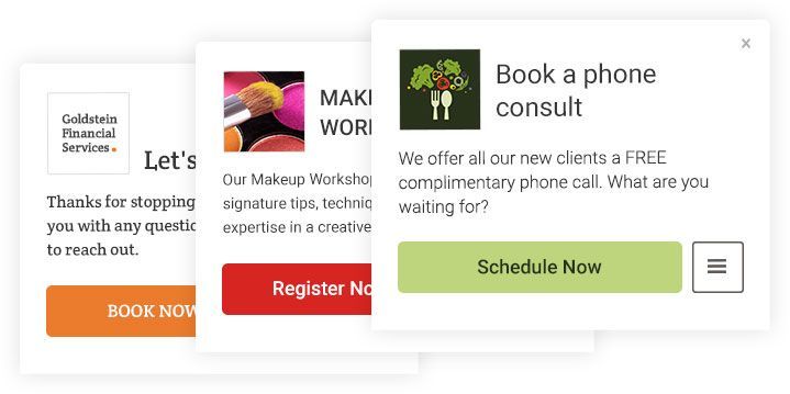
But making your CTAs can’t-miss requires some creative choices, too.
Take the psychology of color for example. Beyond using contrasting colors to make your contact-related CTAs stand out, consider how different colors evoke different emotions in your visitors.
Red, orange and yellow are all associated with urgency and taking action.
Meanwhile, green, blue and purple signal trust, safety and security.
Finally, seemingly “neutral” tones like black and white are associated with calmness and quality.
So while you obviously want to take your business’ branding into consideration, think about how color choices can work to your advantage as well.
Oh, and don’t forget choosing the appropriate language for your CTA. Text such as “Schedule Now,” “Book Today!” or “Start Your Trial” are all more actionable than a mere “Click here.”
5. Build Trust from the Word “Go”
Last but not least, you can’t expect anyone to leave their contact information if your site looks sketchy.
And while looks aren’t everything, you can’t blame someone for being wary if your site has little to no information or looks like it’s from 1995.
In addition to a lead generation tool, some bonus elements to incorporate into your site that screams “I’m legit” include:
- Pictures. Whether it’s a headshot, customer photos or snapshots of your business in action, a picture really does speak volumes to skeptical leads.
- Reviews and testimonials. Highlighting success stories signals that you have a proven track record.
- Links to social profiles. Especially if you’re active on Facebook or Twitter, your leads should see that you’re still in business at a glance.
- A blog. What better place to show off your expertise?
These elements in tandem can help seal the deal for anyone who might otherwise think twice about whether or not they can trust you with their information.
But even with all of this, nothing beats having a proper lead generation tool on deck.
What Are the Best Lead Generation Tools?
There are a lot of tools out there, but we think that our lead management solution takes the cake.
What makes vcita so special though? Good question!
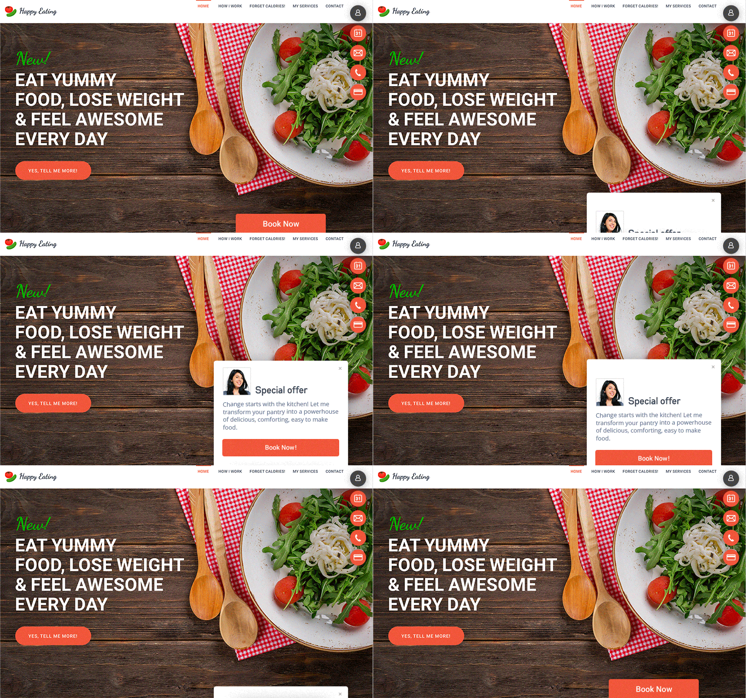
- It works fast. You can capture leads and book clients in a matter of seconds with no needless back-and-forth.
- It’s flexible. Customize your call-to-action to fit your offering: “Book Now”, “Contact me”, “Register for free”, whatever works for you!
- It integrates with any site. Whether you’re running on WordPress, Wix or anything in between, we’ve got you covered.
- It’s customizable. In addition to lookin’ good, you can customize your widget to speak your business’ language and stay in line with your branding.
- It works with mobile. Our widget offers a seamless experience for any sales lead on-the-go.
- It’s made specifically for service businesses. We give you all the essential features you need such as notifications and calendars minus the bloat.
Not bad, huh?
Ready to Turn More Visitors into Hungry Leads?
Don’t let your next visitor be “the one who got away!”
Instead, take the steps to turn your website into a lead-generating machine.
With the help of vcita’s lead capturing tool and smart designer choices on-site, you can get more out of your traffic and transform those would-be clients into success stories.


