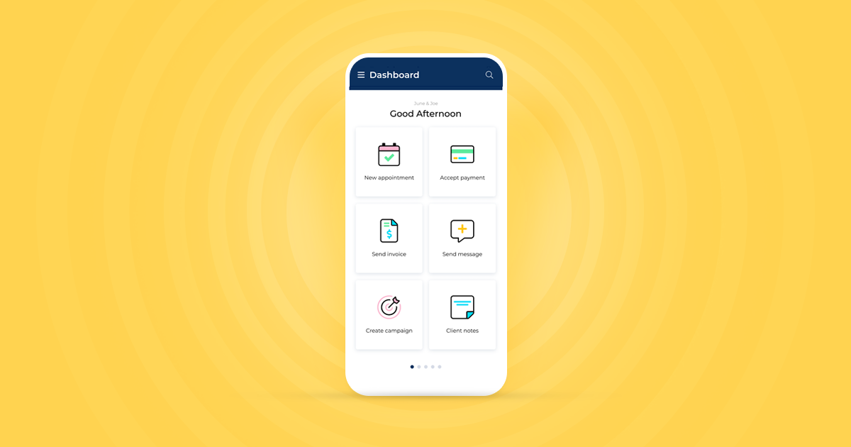
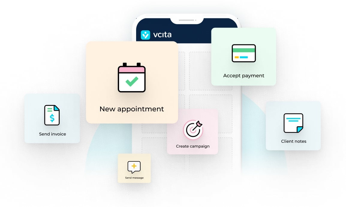
While you’re having tomorrow morning’s coffee, you’ll probably open the vcita mobile app to get a glimpse of the day ahead. You’ll scroll through the day’s upcoming meetings, check new client messages, and maybe generate a quick estimate or invoice.
While what shows up on your screen will look pretty much the same, what happens behind the scenes will be nothing like it was.
Here’s why:
After many months of development and testing, we are extremely proud to launch a brand new mobile app infrastructure. This brand new version of our mobile app uses a completely different backstage, helping us deliver a better, faster, and smoother mobile experience.
Faster. Much faster.
Thanks to the new infrastructure, the app will load quickly and support faster and smoother navigation, helping you move from screen to screen and get the job done quickly and efficiently.
Based on the feedback we received in our recent app survey, we’ve learned that many of you consider start up time to be one of the app’s most important points for improvement.
We hear you. Our goal is for you to pull your phone out of your pocket, and perform any business action within moments. Based on our testing, the new and advanced app loads 2X faster than before.
You’ll also notice the improved new screen navigation! Whenever you click on a screen – it will load instantly without any in-between redirects.
Lightweight & compact
When ordering a burger & fries, bigger is always better. But when you download an app, you want it to be slim and space-saving.
That’s why the new version of the app supports all the current functionalities but requires less space. While the previous version requires 35MB memory space, the new edition only needs 1.9 MB on your iPhone and 18.5 MB on your Android.
Besides clearing up storage space on your device, the app’s lightweight nature also takes less operational memory and processing power (to be exact – 10X less!), ensuring it operates smoothly in the background and doesn’t close every time you use another app.
Having the app remain open in the background will make sure you get notified immediately when an action requires your attention. It’ll also enable you to reopen the app on the page you left it, instead of sending you back to the home screen – so you can continue where you left off!
Land on the page you need
Have you ever tried to view an item in the app, but found that the app first loads the homepage? That can cause a lot of frustration, we know.
The new version of the app will take you to the page you need: When clicking on a direct link to one of the app’s inner pages (like a particular invoice or client card), you’ll notice that the page you’re looking for will load immediately, instead of sending you to the homepage and only then redirecting you to the page you are trying to view.
A foundation for native experiences
vcita’ s mobile app uses web pages in a format that’s ideal for mobile devices. The new structure sets the stage for new and mobile-native app experiences. This will help us further optimize the app’s user experience, and expand it with new features and functionalities.
The team is already working on some exciting enhancements, so make sure to stay tuned for more news!
For partners: faster deployment for regular updates
If you’re a vcita partner with your own version of the mobile app, you’ll find that the new infrastructure supports faster deployment, helping you release updates on a regular basis.
With frequent version updates, you can offer your users continuous improvements.
How do I get the new app?
To upgrade, simply head over to the App Store or Google Play store and confirm the update- it’s that easy. If needed, you can roll back to the previous version at any time.
If you don’t have the vcita app installed yet, head over to the App Store or Google Play store and get started.
Got a question or concern? Please feel free to contact us.


